the futura is now!
-OR- the punnery continues... -OR- Brett pretends to be obsessed with some very small cultural artifacts in order to garner both laughs and pity. -OR- I wish we could open our eyes to see in all directions at the same time.
I was looking at the cover of the new Death Cab album Plans, trying to be a good indie-yuppie, when I noticed something. I noticed the continuation of a trend:

Death Cab

Royal Tenenbaums.

Royal Tenenbaums, again.

Royal Tenenbaums, again, again.

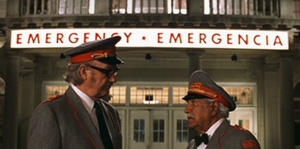
Starbucks. The Life Aquatic.

The Austin Stone, my church (and possibly yours).
Which of these things is not like the other? Well none of these things. They're all like the other. Death Cab, Wes Anderson, Starbucks, The Austin Stone. Each uses the font Futura. I think it must be trendy. Trendier than say, Times New Roman, or maybe even Arial.
I am a font geek.
To make up for it here is a track off of Plans. I've heard mixed reviews, but I like it thus far:
I Will Follow You Into The Dark [care of daily refill]
I'm going to Oklahoma tomorrow. Dan's getting married this weekend. Capital!
I was looking at the cover of the new Death Cab album Plans, trying to be a good indie-yuppie, when I noticed something. I noticed the continuation of a trend:

Death Cab

Royal Tenenbaums.
Royal Tenenbaums, again.

Royal Tenenbaums, again, again.

Starbucks. The Life Aquatic.

The Austin Stone, my church (and possibly yours).
Which of these things is not like the other? Well none of these things. They're all like the other. Death Cab, Wes Anderson, Starbucks, The Austin Stone. Each uses the font Futura. I think it must be trendy. Trendier than say, Times New Roman, or maybe even Arial.
I am a font geek.
To make up for it here is a track off of Plans. I've heard mixed reviews, but I like it thus far:
I Will Follow You Into The Dark [care of daily refill]
I'm going to Oklahoma tomorrow. Dan's getting married this weekend. Capital!
posted by Brett at 11:11 PM
![]()


6 Comments:
What an astute observation.
Here here... good form.
The fonts in that Starbucks and Royal Tenenbaums use are very different. They just look the same. Har har.
You can see it the difference in the letter 'c'.
Me?
Kate if I've told you once I've told you a thousand times...it's not that much harder to use the correct "you're".
Post a Comment
<< Home